Project Description
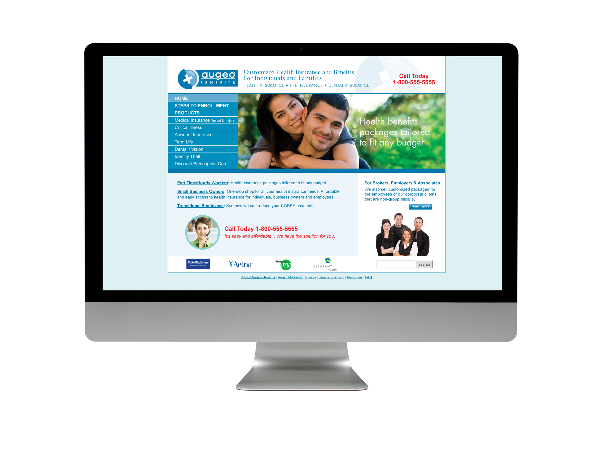
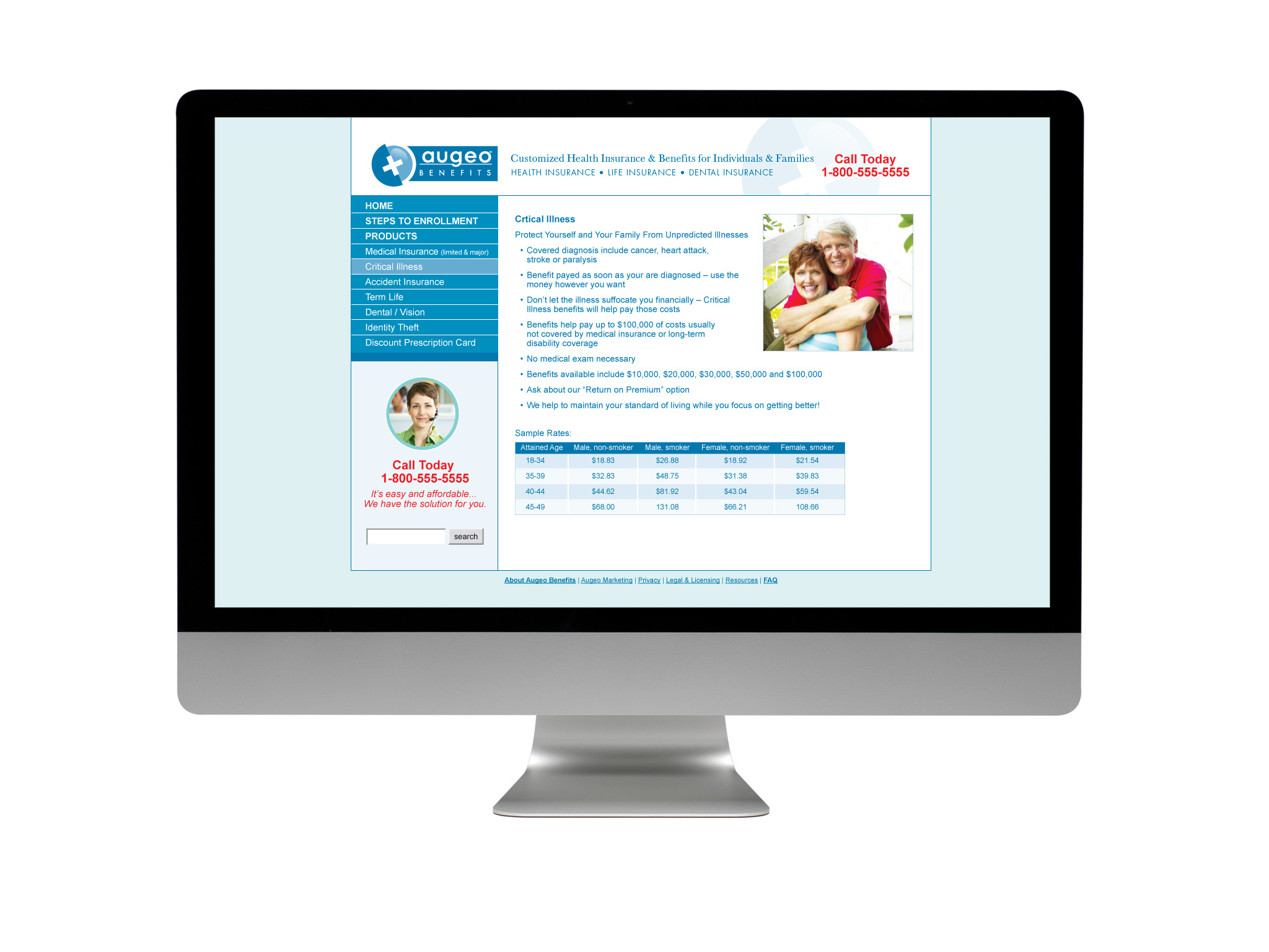
Augeo’s employee benefits service which mainly provided health insurance was rebranded as “Augeo Benefits.” This called for a new logo and a website. Augeo had high conversion rates on sales over the phone so the goal of the site was to get consumers to call into the call center.
The logo and website utilize colors and symbols that fit with the healthcare industry. The blue is close to the color of the sky so it feels open and bright rather than cold and sterile. The photography in the website focuses on people and lifestyle.
Designed while at Spangler Design Team